Selected work
How I think.
McDonald's Germany · 2025
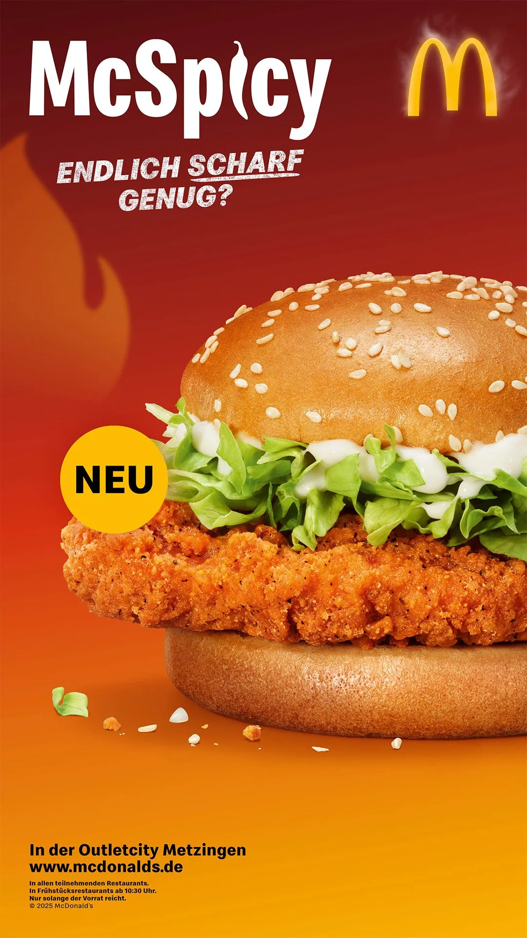
McSpicy — "Endlich scharf genug?"
The brief
Launch a new spicy burger for McDonald's Germany. Stand out in a category where everyone shouts about heat with fire emojis and red gradients.
How I thought about it
"Endlich scharf genug?" reframes the product as a provocation rather than a statement. Instead of showing heat, we made spice a question directed at the audience. I co-developed the concept and naming, explored multiple creative territories, and presented them to the client.
The question mark
I art directed the photoshoot alongside photographer and food stylist — overseeing ingredient placement, texture, and how the burger reads at different crop ratios for OOH vs. social, through to print approval. A statement about heat invites comparison. A question puts the audience in the role of judge — "Endlich scharf genug?" only resolves if they try it.
Award
The campaign platform was later awarded Bronze at the Deutscher Digital Award 2026 (Social Media); a Danny Trejo extension followed using the same platform and visual language, and my contribution is accurately represented within the original campaign.
Sparkasse × PAYBACK · 2024
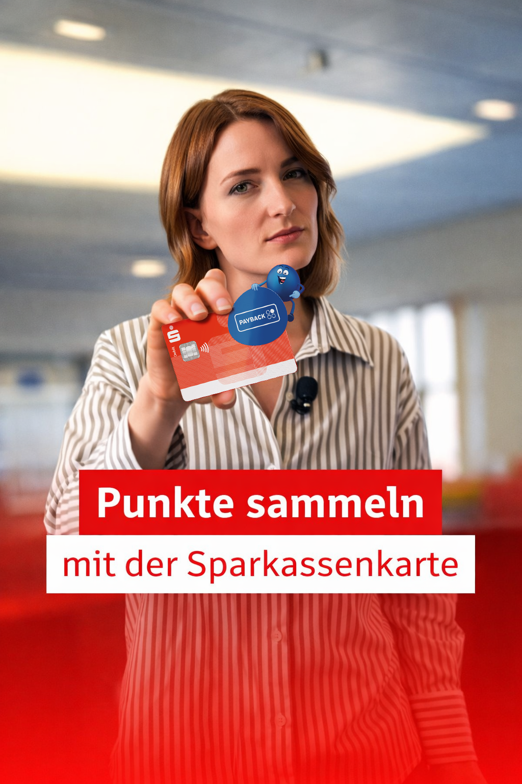
"Bezammeln" — Pitch Win
The brief
Communicate a banking feature - Sparkasse card + PAYBACK points integration - in a way that feels culturally relevant and nothing like a bank ad.
How I thought about it
The product is a behavior: you pay, you collect, simultaneously. What's the word for that? There wasn't one - so we invented it. Bezammeln: a portmanteau of bezahlen + sammeln. I contributed to the winning pitch concept and developed the visual territories.
Why this matters
This is the kind of idea I want to keep making: one that creates language. When advertising invents a word people actually use, you've moved beyond a campaign into something cultural.
Patros / Hochland · 2024
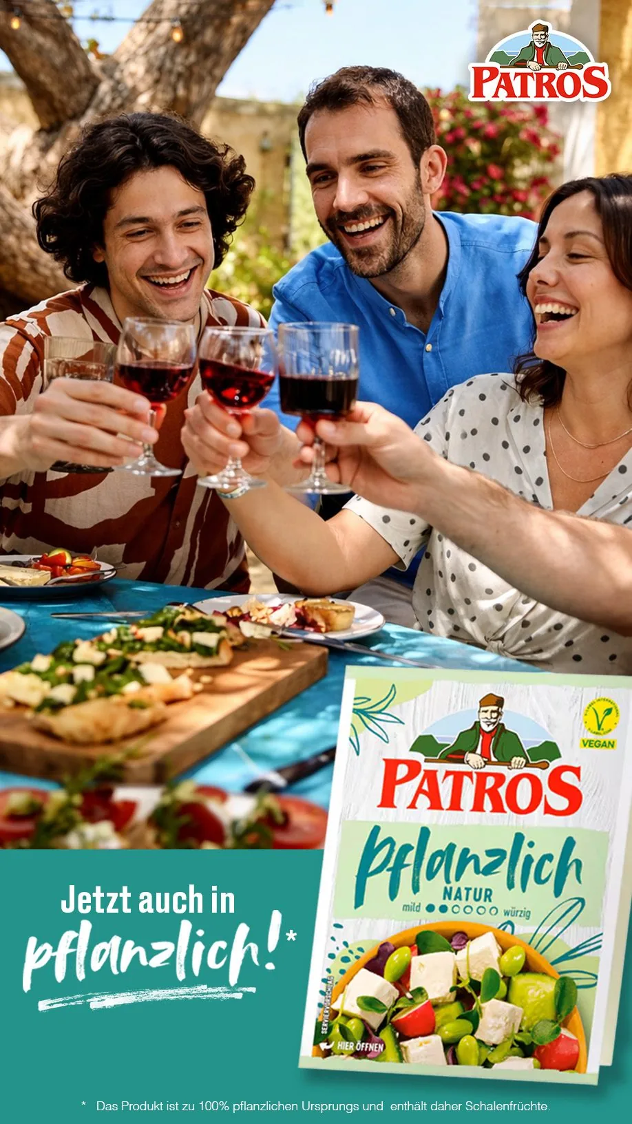
"Endlich Pflanzlich" — Film Campaign
The brief
Launch a plant-based version of Patros without making it feel like a compromise product or another worthy-but-boring vegan ad.
How I thought about it
The film was built around togetherness, ease, and pleasure - not the ethics of what you're eating. I contributed to storyboard and director briefing in pre-production, then was on-set in the Allgäu collaborating with the director and client to keep the visual feel consistent with the campaign intention.
What the brief excluded
Plant-based advertising almost always leads with the ethical argument — which is where most of it loses the audience. This brief started by removing that argument entirely. When a film is about pleasure rather than what you're not eating, the product doesn't need to justify itself. That exclusion was the creative decision.
TUI Magic Life / Scholz & Friends · 2024
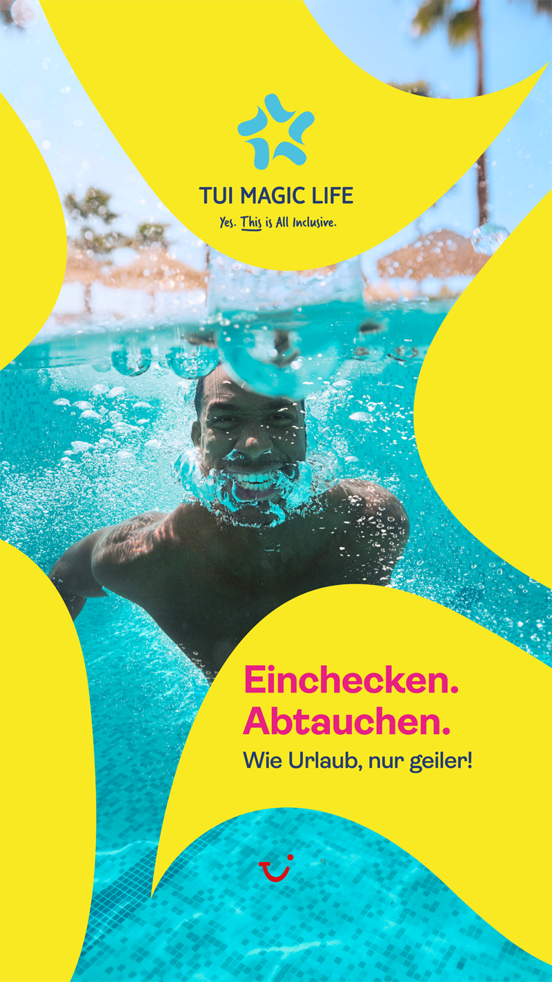
"Wie Urlaub, nur geiler" — Pitch Win
The brief
TUI Magic Life is TUI's all-inclusive club holiday brand - fourteen resorts on the ocean, positioned as the more fun and more accessible alternative to premium competitors. The pitch task: a campaign that makes club holidays feel genuinely desirable to families and couples across digital, social, and large-format OOH.
My contribution
I worked on the pitch — creating campaign assets, adapting visuals across social and print formats, and preparing layouts across different deliverables. The visual system had to carry the energy of the headline: bold colour field, organic shapes, photography that looks genuinely uncontrolled. Each format adaptation was a question of how far you can push the system before it flattens — making sure the energy held from a shopping centre wall down to a phone screen.
What the system had to do
"Wie Urlaub, nur geiler" only works if the visual system gives the headline somewhere to land. A pitch has to show that the system survives format changes — that what works on a shopping centre wall still holds on a phone screen, and the energy doesn't flatten when the frame shifts. Adapting assets is how you prove an idea is actually a system.
McDonald's Germany · 2025
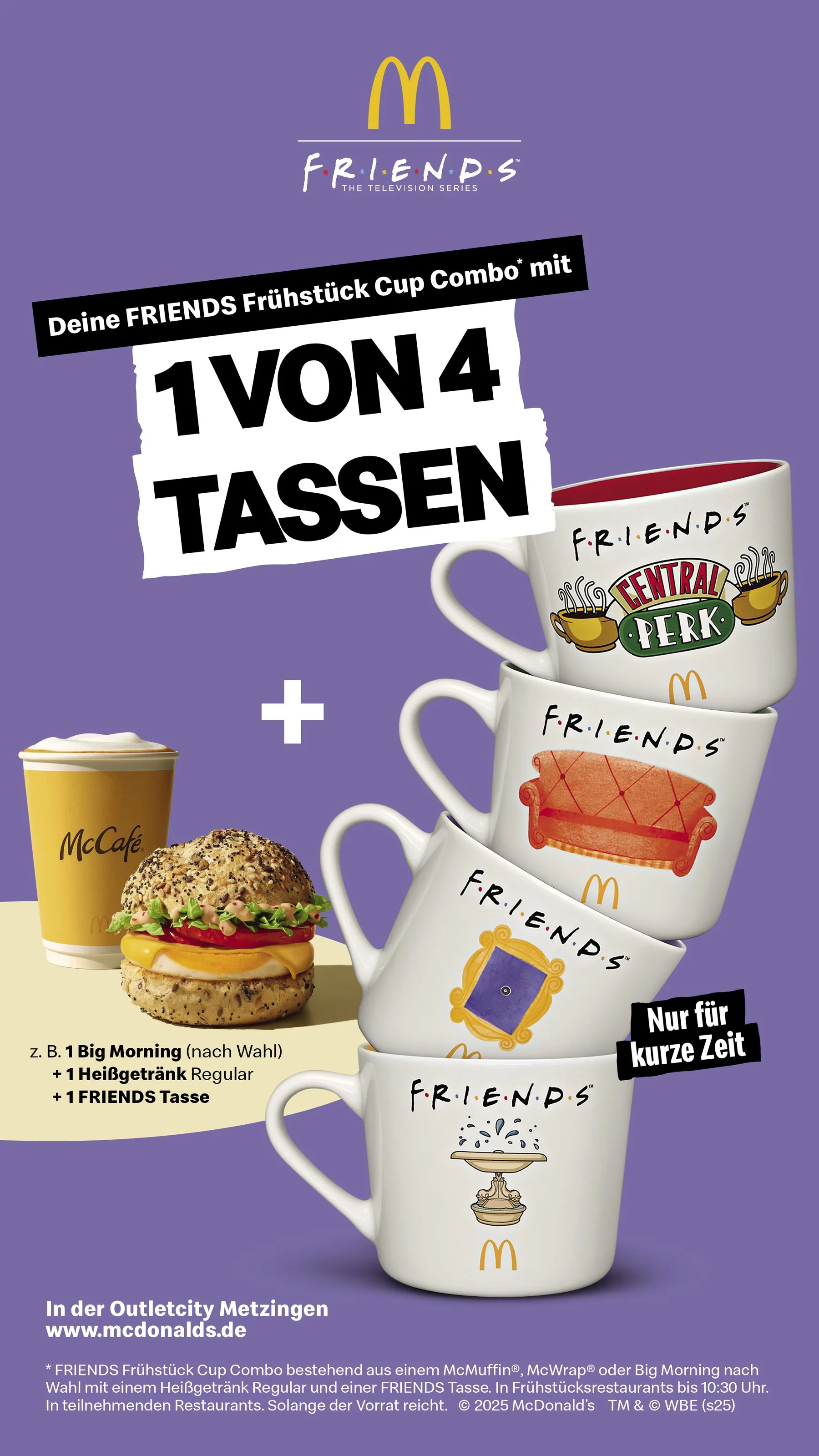
Friends Menu — Campaign System
The brief
A Friends TV tie-in across three parallel campaign phases: figurines, McCafé mug promotion, and cup phases - each needing its own identity while staying coherent within the McDonald's brand world.
How I thought about it
The challenge wasn't designing one campaign - it was designing a system flexible enough to carry three. I built a visual logic anchored in nostalgia that could stretch across figurine collectibles, breakfast promotions, and cup phases without feeling like a copy-paste job. Each execution is distinct; together they're a family.
The constraint
Working with licensed IP means the visual anchor is already set — by the IP, the brand guidelines, and three campaign phases running simultaneously. The creative problem shifts from "what should this look like" to "how do three things feel like a family without repeating each other." The constraint defines the brief.
McDonald's Germany · 2025
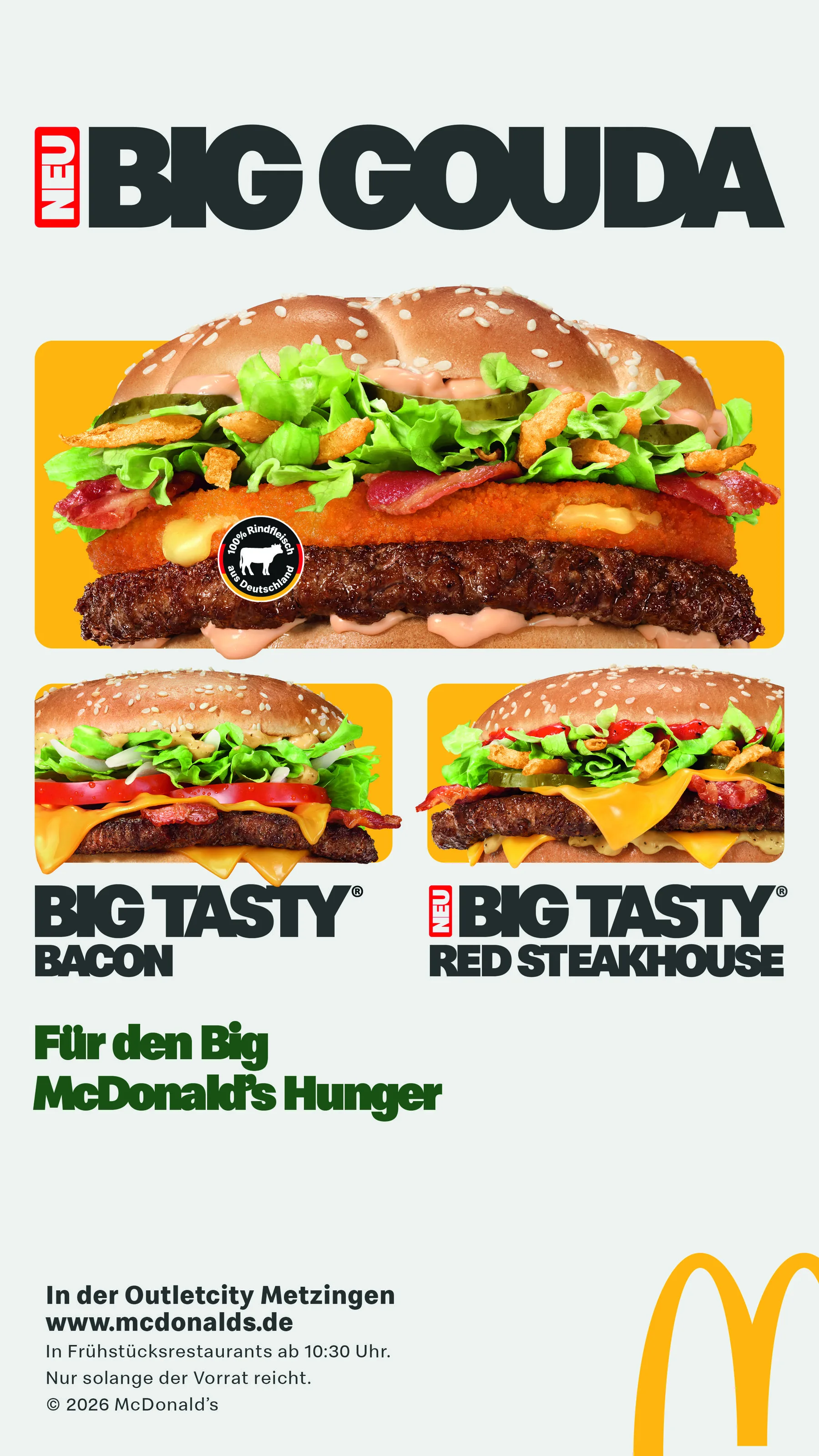
Big Gouda — On-Set AD & Social Content
The brief
Produce social-first content for the Big Gouda launch - a premium beef product at McDonald's Germany. The assets needed to feel distinct from standard campaign material: less constructed, more alive.
My role
I was on set as Art Director, responsible for the social content capture alongside the main production. That meant working fast and independently - framing handheld shots, directing short-form video sequences, and making sure every asset was built for how people actually consume content on platform, not how campaigns get presented in pitch decks.
Against the production
A campaign production is built to look controlled — every frame considered, no accidents. Platform-native content has to look like the opposite. Working on the same set for both means making choices that actively contradict what the production around you is designed to produce. Each handheld shot was a decision to push against the frame next to it.